
Grand River Council on Aging
Designing a scalable community platform to support the next generation of seniors

Overview
The Grand River Council on Aging (GRCOA) is a non-profit charity organization that works to support aging individuals and communities across Brant County through social connection, information and service support, and age-friendly planning.
It provides access to senior-focused resources & services, hosts educational events and workshops, fundraises for initiatives, and supports community volunteer work. My team worked with the GRCOA to redesign its digital ecosystem to better support the needs of next generation seniors.
Goals
-
Address critical usability issues in the current information architecture
-
Create a scalable design foundation that can support the GRCOA in expanding and adapting their platform over the next 20 years.
Role
Design, Research
Responsibilities
End-to-End UX design
Team
Design, Business
Tools
Figma, Figjam, Excel
The problem
Poor site usability, lack of scalability, and a major awareness gap meant that the GRCOA’s current digital solution was ill-equipped to support the next generation of seniors (current 45-55 year olds). Those who would benefit from the GRCOA’s services were largely unaware of them, and ineffective information architecture, poor visual design, and accessibility issues made accessing the services difficult.
Business needs: a scalable, low-cost solution that is easy to grow and adapt to fit the needs of the next generation of seniors within the limited resources available as a non-profit.
User needs: an intuitive, efficient way to understand what relevant aging services and community offerings are available and how to engage with them.
How might we
How might we design an intuitive, scalable digital solution that meets the needs of today’s 45-year-olds while evolving to support them and the community in crafting an age-friendly future over the next 20 years?
Discovery
Understanding our future users
To better understand the needs, priorities, and workflows of the next generation of seniors, we conducted a series of contextual inquiries with 20 participants in our target age demographic. We observed our participants as they performed tasks related to aging research, planning, and evaluating online resources.
From this data, we identified the participants goals and priorities for aging related research and planning, community engagement habits, and aging support priorities.
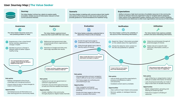
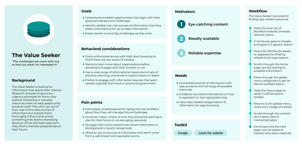
Archetype
The Value Seeker
Motivator
Reliable expertise & high-quality info
Primary behavior
High-level browsing for relevant topics.
Based on the synthesis results of the research, I developed several user archetypes and journey maps to outline the distinct ways users approach aging resources:
Design artifacts
Archetype
The Optimizer
Motivator
Efficiency and speed
Primary behavior
Uses AI tools to find and summarize info


Archetype
The Socializer
Motivator
Community connection & fulfillment
Primary behavior
Relies on social media and social networks to find and share info


Defining information architecture
To ensure the new site structure aligned with our target audience’s mental models, I conducted an open cart sort with 10 participants. Key improvements included:
Improved labeling
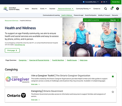
Updated confusing or nondescript labels such as "InfoHub." Our testing revealed a strong preference for "Resources & Services."
New navigation
Introduced a streamlined global menu and new local navigation that better aligns with participant labeling and grouping patterns.
Consolidation
Reduced site complexity by combining pages that users consistently grouped together, such as "Discounts" being moved under "Resources."
Design
Exploring initial design concepts
Based on the discovery research and card sort findings, I began exploring low- to mid-fidelity design solutions. My initial comprehensive redesign of the web experience focused on three core pillars: Organization, Accessibility, and Scalability.
Organization
Simplified complex workflows for tasks like event registration and accessing services, and established a consistent visual hierarchy to reduce clutter and confusion on primary site pages.
Accessibility
Transitioned to a minimalist approach to reduce visual strain, simplified graphics, and improved interaction clarity for key components like buttons and navigation.
Scalability
Introduced a modular design approach to support future growth and changes to content in dynamic areas like events and resources.
Initial design concept

Original site

Iteration
Validating design decisions
I conducted two rounds of moderated usability testing to validate decisions and move the design from mid-fidelity concepts to a polished high-fidelity experience.


Mid-fidelity testing
Using scenario-based testing with 5 participants, I evaluated critical workflows such as event registration, service and resource finding, and volunteer applications.
Example scenarios and tasks
Tasks and scenarios focused on the most critical workflows, as determined by the organization's goals and user needs identified during discovery research.
Metrics
Follow-up questions were used to collect ease of use and confidence ratings for each scenario. Error and success rates were also collected:
-
Success rating: 100%
-
Confidence rating: 4.94/5
-
Ease of use rating: 4.87/5
-
Avg Errors per task: <1
Key findings
While the tasks were completed successfully and without major friction, we uncovered several areas of potential confusion or inefficiency within the designs:
-
Volunteer application was seen as too long and tedious to fill out
-
Uncertainty around what the consequences of “saving” a resource were due to lack of visual feedback
-
Confusion around the difference between “virtual workshops” and “events"
Next iteration changes
To address the pain points that arose during testing, we introduced several changes in our next iteration high-fidelity design:
-
Feedback loops: added "toast" notifications and a counter on the saved list icon to improve clarity of the saving action.
-
Streamlined forms: removed unnecessary form pages and simplified application process.
-
Event clarity: included upcoming virtual workshops in the main event page instead of with the past workshop recordings to better align with users expectations and workflows.

High-fidelity testing
The second round of testing involved 5 participants and an expanded set of scenarios to test the limits of the new UI and interaction design.
Metrics
Success Rate: Remained at 100% for repeated scenarios.
Refinement: Qualitative feedback was significantly more positive, though Ease of Use scores dipped slightly (4.5/5) as the high-fidelity environment allowed for more "free exploration" and minor user errors.
Key findings
Qualitative feedback from participants was significantly more positive with the new designs, with fewer areas of confusion or uncertainty during task completion. The only repeated friction point that arose was around volunteer applications, with participants wanting a ‘one-click’ way to apply for a specific role.
Next iteration changes
-
Form efficiency and clarity: introduced button to apply from a specific role and auto-fill relevant information, improved copy clarity around next-steps.
-
Recognition over Recall: Added specific location-type tags to event pop-ups to help users plan at a glance.


Outcome
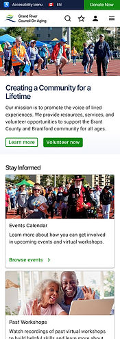
A scalable design foundation to support age-friendly Grand River communities over the next 20 years
The final solution is an intuitive, scalable platform that bridges the gap between 45-year-old "planners" and the current senior community. It transforms a static information site into a functional tool where users can manage saved resources, register for skills workshops, and engage with community planning.
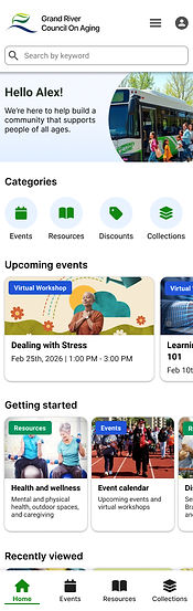
To support the increasing prevalence of mobile-first users in our target age demographic, we also expanded the product ecosystem into a mobile application that allows for more personalization, customization, and flexibility.
A responsive and scalable design system
Our new design uses a modular card-based system on Home, Events, and Resource pages to allow for easy updates and additions as changes occur.
It also uses responsive components, helping to ensure that the platform effectively meets users across all mobile and desktop interfaces.

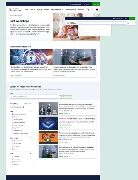
Comprehensive search and navigation
By expanding local navigation, adding site and page-level search and filtering, and making data-informed updates to IA and labeling, our new designs supports a clearer, more efficient experience.
An inviting and trustworthy platform
Key updates to the platform, from simplified visual design to clear information architecture and interaction design, work to transform the GRCOA web platform into an effective, trustworthy experience that encourages engagement, learning, and community support.
Primary workflows and points of interest are now emphasized on the Home page and in the navigation menu, supporting easy ways to access, evaluate, and use services offered.

